/
Core Usage & Interaction
Turn decision paralysis into forward momentum by creating clear visual hierarchy that guides users to the right action without hesitation.
what would you do?
Your landing page has two equally prominent buttons: "Sign Up" and "Learn More." Users hesitate and bounce. What's wrong?
Both buttons look important. Users pause to decide. Choose the root cause:
A
Should use different colors to differentiate them.
B
Need to add more button options so users have real choice.
C
Button text is too short and needs more explanation.
D
No clear hierarchy. Both buttons compete for attention equally.
The Problem
Many products accidentally create "choice conflict" at the exact moments they need momentum. Baymard Institute notes that competing call-to-action buttons distract users and make it harder to add to cart and complete purchase, raising the risk of abandonment. [1]
Even when choice is legitimate, the hierarchy is often ambiguous. In checkout, users hesitate because they don't know whether the primary button will finalize the order or move to a review step. That uncertainty intensifies after entering payment details. [2]
Inconsistency in placement breaks learned patterns. First Round Review warns against forcing users to hunt for the dominant CTA in a new corner after they've been repeatedly tapping it in a consistent location. Unexpected shifts risk losing users. [3]
The Solution
Design action hierarchy as an end-to-end system: define the primary intent per screen, encode priority via visual weight and placement, clarify outcomes via copy, and ensure feedback prevents uncertainty. [4]
The 3-Second Clarity Test for Action Hierarchy
A user should instantly know:
1) What is the main action here (the default "forward")?
2) What happens if I click it (outcome, not just "Continue")?
3) What is the safe alternative (cancel, back, learn more) and is it clearly secondary?
4) Am I being asked to decide before I understand enough?
Practical rules that hold across products: Prefer one primary action per decision surface (screen, modal, step), and demote everything else to secondary or tertiary. Use visual emphasis deliberately: primary should be most prominent, secondary should be medium emphasis (often outline), tertiary should be lowest (often text). [5]
Real Examples
Clear Primary with Text Link Secondary
One large primary button, one clearly subordinate text link below [6]

Better Stack
How they do it
Better Stack's onboarding form collects user info (name, organization, source) with a large purple primary button at the bottom: "Send me a test alert" with a forward arrow icon. Below it, centered and styled as gray text: "I don't want to receive a test alert right now." The primary button dominates visually. The secondary option is present but clearly subordinate in size, color, and weight.
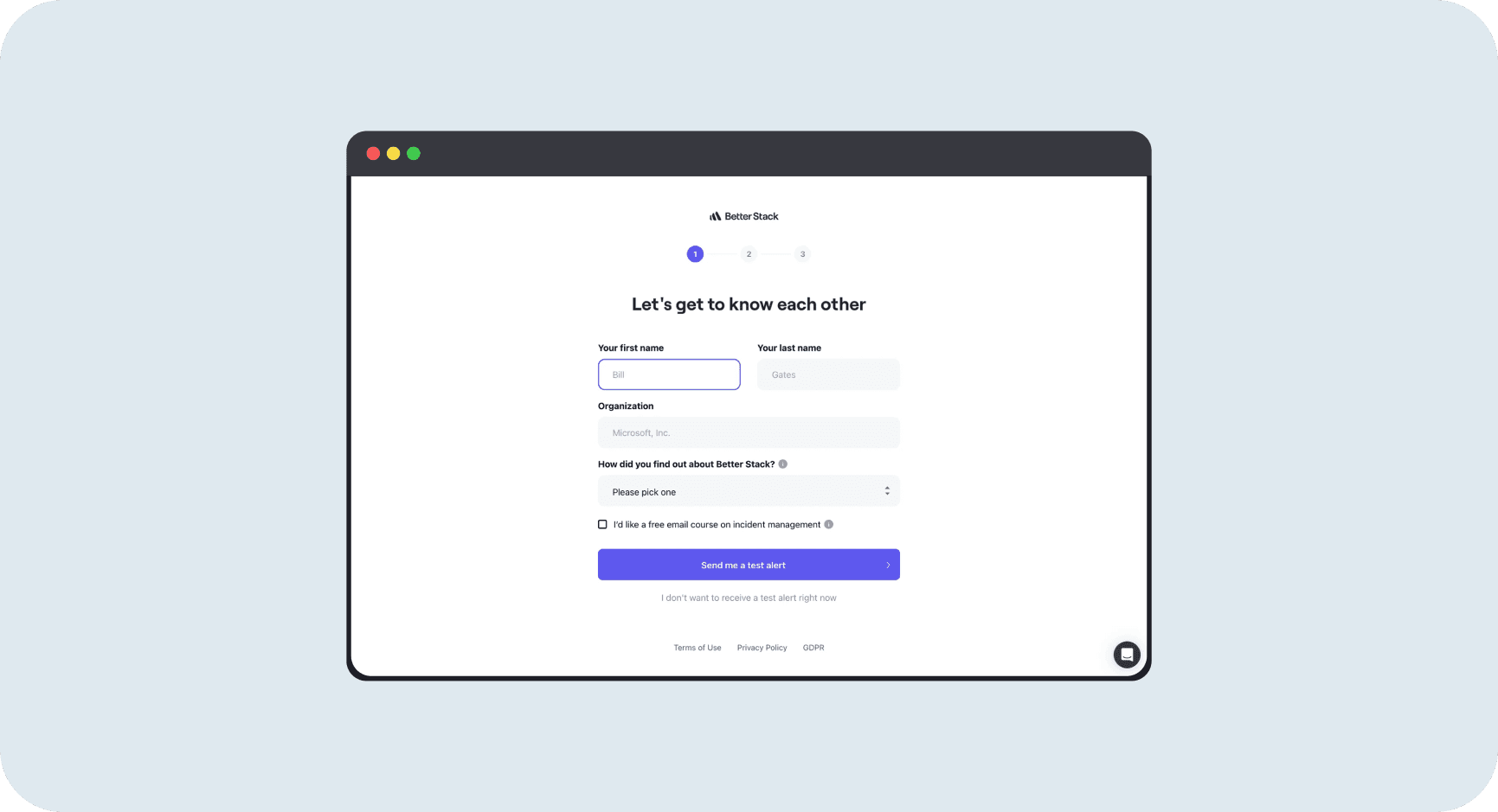
Why it works
The primary action is unmistakable. Users know exactly what the main path is: send a test alert. The secondary option (skip) is available for users who need it, but it doesn't compete for attention. The hierarchy is encoded through size, color, and placement. The text link doesn't distract from the primary goal. This matches Nielsen Norman Group guidance: primary buttons should have the most emphasis, secondary actions should be clearly subordinate.
Choice Selection with Single Primary Forward Action
Two equal-weight choices for format, one dominant "Continue" to advance [7]
E-commerce Action Hierarchy
Primary "Add to cart," secondary "Buy now," clear visual weight difference [8]
Context | Primary Action | Secondary Treatment | When to Use |
|---|---|---|---|
Signup/Onboarding | Large filled button (e.g., "Send me a test alert") | Text link below (e.g., "Skip for now") | Acquisition flows where forward momentum matters most |
Format/Choice Selection | Equal-weight cards for choice + single "Continue" | No secondary (choice itself is the decision) | Legitimate alternatives where both options are valid |
E-commerce Product | "Add to cart" (colored, prominent) | "Buy now" (different color, below) | Shopping flows that support browse + direct purchase |
Feature Upsell | "Upgrade" (large, filled) | "Next feature" or "Maybe later" (outline) | Conversion moments with exploration alternative |
High-Stakes Checkout | "Continue to review" with microcopy | "Back" (text link or outline) | Payment steps where clarity reduces abandonment |
Mistakes That Kill Success
avoid this
Two Primary Buttons on the Same Decision Point
Competing CTAs distract users and make it harder to progress. Baymard warns this is particularly damaging in commerce where the critical path is "add to cart then buy." If two actions are equally weighted, you're asking users to solve your prioritization problem. [9]
Fix
Prefer one primary action per decision surface. Demote secondary to outline or text link. Visual hierarchy should match intent hierarchy.
avoid this
Secondary Action Positioned Above or Too Close to Primary
Netflix explicitly tested placing a secondary button above the primary signup CTA and rejected the variants. Even when both actions are legitimate, prominent secondary options near the primary can reduce the intended behavior. [10]
Fix
Keep secondary actions below the fold or in footer areas. Preserve forward momentum by removing competing options from the high-attention zone.
avoid this
Vague Primary Copy Like "Continue" or "Next"
Nielsen Norman Group recommends avoiding generic labels because they don't clearly describe what the button will do. Baymard shows users hesitate if they can't tell whether the primary button will charge them. This is especially damaging at high-stakes steps. [11]
Fix
Replace "Continue" with outcome labels: "Continue to review," "Place order," "Start free trial." Tell users what happens next, not just that they're moving forward.
Metrics That Matter
Primary-to-Secondary Click Share
Percentage of total action clicks that go to the primary vs secondary button. This tells you if your hierarchy is working visually. Low primary share means users are confused about what to do. [14]
Benchmark
Primary should capture >70% of clicks when both are visible. If secondary is getting 40-50% of clicks, your hierarchy is ambiguous.
How to Measure
Formula: Primary Share = (Primary clicks / (Primary + Secondary clicks)) × 100
Track by screen and user segment. New users should have even higher primary share.
Task Completion Rate
Percentage of users who complete the intended flow after seeing the decision point. This is the ultimate test of whether your hierarchy helps or hurts momentum. [15]
Secondary Assist Rate
Percentage of secondary clickers who later complete the primary goal. Measures if your secondary action (like "View demo") supports conversion or distracts from it. [16]
The Opportunity
50%
Conversion rate increase when Pinterest interrupted scroll with clear signup CTA (Reforge case study) [17]
Better Stack: Text Link Secondary
Large primary "Send me a test alert" with subordinate "I don't want to" text link below. Clear hierarchy without hiding the skip option. [18]
Glide: Choice + Single Forward
Two equal format cards (legitimate choice) with one dominant "Continue" button. Separates choice from action. [19]
Shop: Purple vs Black Buttons
"Add to cart" primary in purple, "Buy now" secondary in black. Clear visual weight difference supports both browse and direct purchase. [20]
Resources Worth Your Time