MODAL
MODAL
MODAL
Creating Focused User Experiences
Creating Focused User Experiences
Creating Focused User Experiences
Modals offer a dedicated space for critical interactions by overlaying content and drawing attention to essential tasks or information. This guide covers effective design strategies to craft modals that are user-friendly, accessible, and seamlessly integrated, ensuring minimal disruption and maximum clarity.
Modals offer a dedicated space for critical interactions by overlaying content and drawing attention to essential tasks or information. This guide covers effective design strategies to craft modals that are user-friendly, accessible, and seamlessly integrated, ensuring minimal disruption and maximum clarity.
Modals offer a dedicated space for critical interactions by overlaying content and drawing attention to essential tasks or information. This guide covers effective design strategies to craft modals that are user-friendly, accessible, and seamlessly integrated, ensuring minimal disruption and maximum clarity.
Tip 1
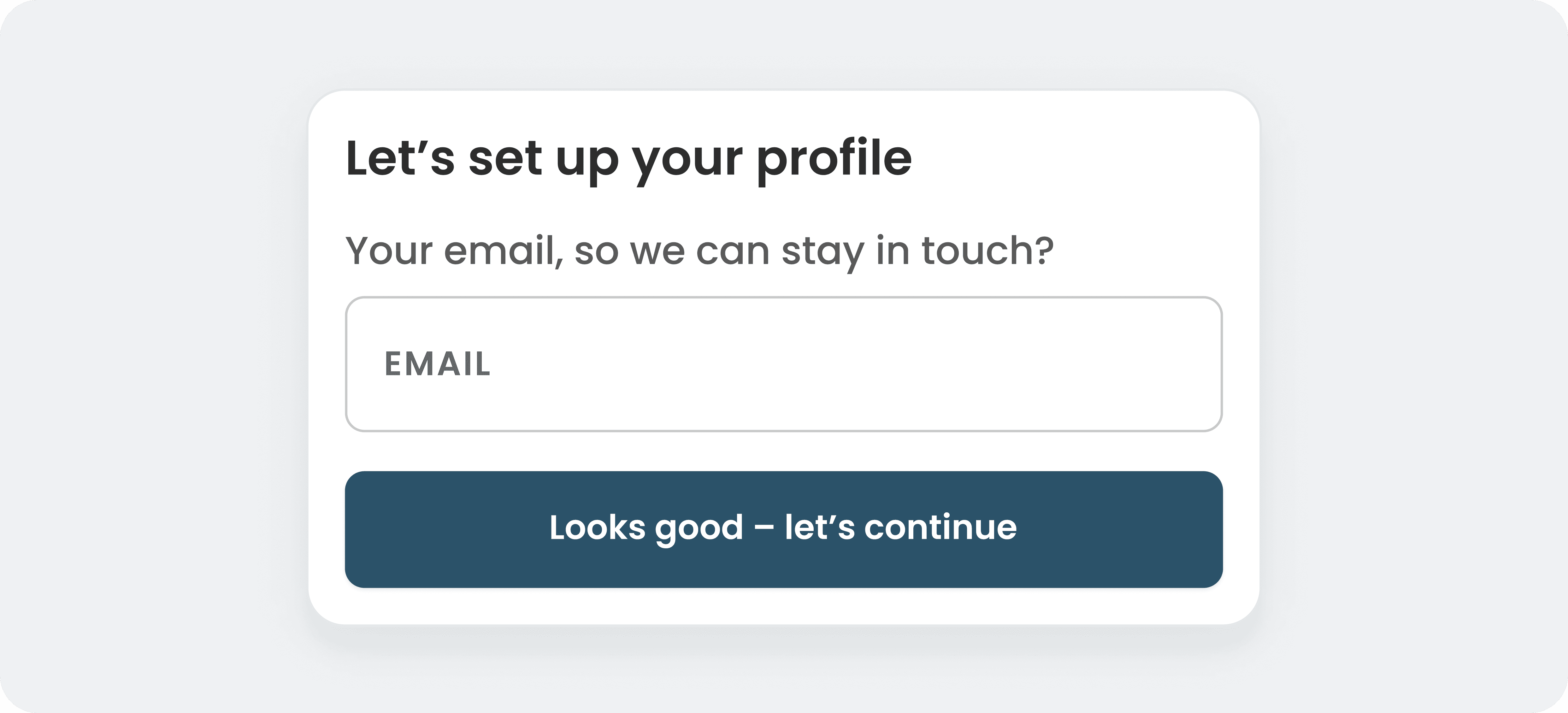
Clear Headline for Clarity
A well-crafted, clear headline immediately conveys the purpose of the modal, helping users process the information faster. Instead of generic titles like “Warning” or “Alert,” use specific language such as “Save Changes Before Exiting” or “Verify Your Email to Continue.” This minimizes cognitive load and ensures users know exactly what action is expected.

Tip 1
Clear Headline for Clarity
A well-crafted, clear headline immediately conveys the purpose of the modal, helping users process the information faster. Instead of generic titles like “Warning” or “Alert,” use specific language such as “Save Changes Before Exiting” or “Verify Your Email to Continue.” This minimizes cognitive load and ensures users know exactly what action is expected.
Tip 2
Action-Oriented Primary Button Text
Button text should clearly describe the outcome of the action. Vague labels like “Submit” or “Okay” can leave users uncertain about what happens next. Instead, opt for descriptive calls to action like “Save Progress,” “Confirm Order,” or “Send Feedback.” This approach improves clarity and boosts user confidence in taking action.
Tip 3
Contextual Dismiss Option
Dismiss options should provide clear context to prevent unintended exits. Instead of using a simple “Cancel” button, try contextually relevant dismissals such as “Keep Browsing,” “Go Back,” or “Don’t Save Changes.” This approach makes it easier for users to understand the result of their choice and reduces errors or frustration.
Tip 4
Error State Reassurance
Errors can frustrate users, but you can reduce friction by offering clear next steps directly within the modal. Instead of the generic “Something went wrong” message, try “We couldn’t connect to the server. Please check your internet connection and try again.” Providing actionable solutions reassures users and helps them quickly recover from issues.
Tip 5
Permission Request Framing
When requesting permissions, users often hesitate unless they see clear value. Frame the request in a way that highlights the benefit, such as “Enable notifications to get real-time updates on price drops” or “Allow location access to find nearby stores with exclusive deals.” This approach builds trust and increases acceptance rates.
Tip 6
Progress Feedback for Multi-Step Actions
When users encounter a multi-step process, progress indicators can be crucial for guiding them through. Adding simple labels like “Step 2 of 4” or “3 more steps to go” helps manage expectations, reduce uncertainty, and increase task completion rates. Without feedback, users may feel lost or overwhelmed, leading to drop-offs.
Tip 7
Avoid Negative Consequence Wording
Modals that warn users about irreversible actions should aim to reduce anxiety, not increase it. Instead of using harsh, fear-inducing messages like “This action cannot be undone,” reframe it to be informative yet reassuring, such as “Deleting this file removes it permanently. Are you sure you want to proceed?”
Tip 8
Affirmative Confirmation Text
When confirming actions, use positive, reinforcing language to make the user feel good about completing a task. Instead of the typical “Your action was successful,” try “Great! Your order has been placed, and a confirmation email is on its way.” This small shift creates a more satisfying user experience and boosts trust.
Tip 9
Offer Alternative Next Steps
When users are reluctant to proceed with the primary action, providing an alternative can reduce frustration. For example, if a modal prompts for email signup but the user isn’t ready, offering an option like “Continue as guest” or “Maybe later” respects user intent while keeping them engaged.
Tip 10
Reduce Decision Paralysis by Highlighting One Action
When a modal presents multiple options, highlight the primary action visually to guide users toward the most desirable outcome. For example, in a pricing modal, bolding the most recommended plan with “Best Value” can simplify the decision-making process and improve conversions.
Tip 11
Leverage Loss Aversion in Retention Modals
When users attempt to cancel a subscription or delete their account, highlight what they’ll lose. For example, “Canceling means losing access to your saved data and premium features.” This taps into loss aversion, a powerful psychological motivator, while respecting user autonomy.
Tip 12
Encourage Engagement with Reward-Oriented Copy
If your product offers gamification or rewards, use modals to drive engagement by highlighting achievements. For example, “Complete your profile to earn 500 bonus points!” subtly encourages users to continue interacting with the product while making it feel rewarding.
Tip 13
Encourage Experimentation with A/B Testing Modals
When running A/B tests, use modals to explain changes to users if they are noticeable. For example, “We’re testing a new layout to improve your experience. Let us know what you think!” This approach keeps users informed, improves transparency, and can lead to valuable feedback.
Tip 14
Social Proof in Popups
Social proof can be highly persuasive in modals. Incorporate language that reflects trust and popularity, such as “Join 5,000+ satisfied customers” or “Thousands of users have already upgraded.” This can make users feel more confident about their decision by implying they’re not alone in taking the next step.
Tip 15
Urgency with Empathy
Creating urgency is a common tactic, but when done without empathy, it can feel pushy. Instead of aggressive language like “Offer ends now!” try something softer and user-friendly: “Only available until [date]—we don’t want you to miss out!” This creates a sense of urgency while maintaining a positive tone.
Enjoyed these tips?
Enjoyed these tips?
Subscribe to get clear, practical product tips delivered to your inbox every week.
Get clear, practical UI tips every week — straight to your inbox.
No spam. No fluff. Just useful ideas you’ll actually want to try.
Previous Component

Next Component
Tip 14
Social Proof in Popups
Social proof can be highly persuasive in modals. Incorporate language that reflects trust and popularity, such as “Join 5,000+ satisfied customers” or “Thousands of users have already upgraded.” This can make users feel more confident about their decision by implying they’re not alone in taking the next step.